TikTalk Mobile Application UI/UX Design
Project description TikTalk is an online dating app that offers a range of features to connect users, including chat, video calls, broadcasting, and viewing people nearby. The...

Project description
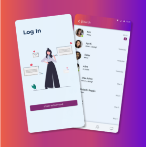
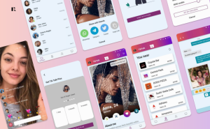
TikTalk is an online dating app that offers a range of features to connect users, including chat, video calls, broadcasting, and viewing people nearby. The primary goal of TikTalk mobile application UI/UX design is to facilitate meaningful connections through various interactive and engaging functionalities. The project aimed to create an intuitive and visually appealing user interface while ensuring a seamless user experience.
Project summary
| Industry: Digital Media & Social Platforms |
Business Goals: to develop a design that will contain a range of features |
| Team: 1 Designer |
Expertise: Design & User Experience |
| Applied technologies: Figma, Photoshop |
Business Challenge
The main challenges of the project were:
- Diverse Interaction Modes: Integrating multiple interaction modes (chat, video calls, broadcasting) within a single cohesive platform.
- User Engagement: Designing features that keep users engaged and encourage them to interact frequently.
- Intuitive Navigation: Creating an intuitive navigation system that allows users to easily access different features without confusion.
Solution
To address these challenges, a comprehensive UI/UX design strategy was implemented, focusing on user engagement, security, and seamless interaction:
User Research and Persona Development:
- Conducted extensive user research, including surveys and interviews, to understand user preferences, behaviors, and pain points.
- Developed user personas to represent the app’s diverse user base and guide the design process.
Integrated Interaction Modes:
- Designed a unified interface that seamlessly integrates chat, video calls, and broadcasting functionalities.
- Ensured each interaction mode is easily accessible from the main navigation to provide a cohesive user experience.
Engaging User Features:
- Introduced gamification elements, such as badges and rewards, to encourage user engagement.
- Designed a “People Nearby” feature with advanced filters to help users find potential matches based on proximity and preferences.
Intuitive Navigation and UI Design:
- Developed a clean and modern interface using a visually appealing color palette and clear typography.
- Created an intuitive navigation system with easily accessible menus and clear icons to guide users through the app.

Delivered Results
The TikTalk app was successfully designed and developed, delivering a user-friendly and engaging online dating platform. Key outcomes included:
High User Engagement:
- Users responded positively to the integrated interaction modes, leading to increased engagement and activity within the app.
- The “People Nearby” feature and gamification elements significantly boosted user participation and interaction.
Intuitive User Interface:
- The clean and modern design, coupled with intuitive navigation, resulted in high user satisfaction and ease of use.
- Users found the app easy to navigate, with clear access to chat, video calls, and broadcasting features.
