Interactive Data Dashboards: Trends and Best Practices
Introduction In today’s data-driven world, static reports aren’t enough. Companies need real-time insights to make informed decisions quickly. That’s where interactive data da...
Introduction
In today’s data-driven world, static reports aren’t enough. Companies need real-time insights to make informed decisions quickly. That’s where interactive data dashboards come in. They turn raw data into dynamic visuals, helping teams analyze trends, spot opportunities, and solve problems faster. But not all dashboards are created equal. Some are more confusing than enlightening. Others overwhelm users with too much information. To create effective dashboards, you need to understand both the latest trends and best practices. Let’s dive into what’s shaping the future of interactive data dashboards and how to design them for maximum impact.
Trends Shaping Interactive Data Dashboards
1. AI-Powered Insights
Artificial intelligence (AI) is changing the way we interact with data. Instead of manually analyzing reports, AI-powered dashboards automatically highlight key trends. They can even suggest actions based on the patterns they discover. This saves time and reduces the risk of human error.
2. Customization and Personalization
Not all users need the same data. Modern dashboards offer personalized views based on roles, preferences, and previous interactions. Whether you’re a CEO, a marketing manager, or a data analyst, the dashboard adapts to show what’s most relevant to you.
3. Real-Time Data Streaming
Gone are the days of waiting for end-of-day reports. Companies now rely on real-time dashboards that update instantly. This is especially important for industries like finance, e-commerce, and logistics, where a few minutes can make a big difference.

4. Mobile-First Design
More and more professionals are accessing dashboards on the go. Mobile-responsive designs make it easier to view and interact with data on smaller screens. Touch controls, simplified layouts, and voice search capabilities are becoming standard.
5. Integration with Multiple Data Sources
Dashboards that pull data from multiple sources – CRM systems, social media, IoT devices, etc. – provide a more complete view. Companies no longer rely on isolated data sets. Instead, they combine multiple streams of information for better decision making.
6. Enhanced Data Storytelling
Data is only useful when people understand it. Modern dashboards don’t just display numbers; they tell a story. Interactive charts, animations, and narrative explanations help users quickly digest information and confidently make data-driven decisions.
 | Instandart")
Best Practices for Building Effective Interactive Data Dashboards
1. Keep It Simple
Less is more. A cluttered dashboard confuses users and reduces its effectiveness. Focus on the most important metrics and remove unnecessary distractions. If something doesn’t add value, remove it.
2. Prioritize User Experience (UX)
A great toolbar isn’t just functional – it’s a joy to use. Design it with the user in mind. Make sure navigation is intuitive, buttons are easy to find, and interactions are smooth. If users can’t find what they need, they won’t use it.
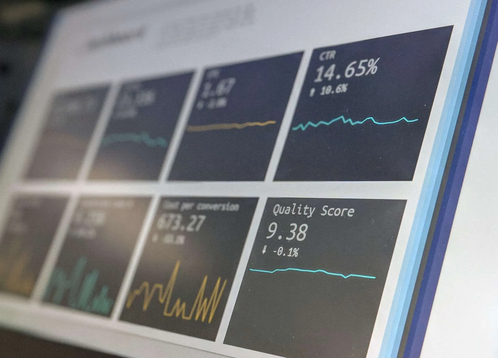
3. Use the Right Visualizations
Not all charts are created equal. Choose visuals that best represent your data. For example, use line charts for trends, bar charts for comparisons, and heat maps for density analysis. Avoid flashy animations that distract from the message.

4. Ensure Data Accuracy and Consistency
An interactive data dashboard is only as good as the data that powers it. Make sure your sources are reliable and that your metrics are calculated consistently. Mistakes can lead to bad decisions, so implement regular data validation processes.
5. Optimize for Speed
No one likes waiting for data to load. Optimize dashboard performance by reducing heavy calculations, caching data, and using efficient queries. A slow dashboard annoys users and reduces adoption.
6. Enable Customization Options
Different users have different needs. Let them customize their dashboard by choosing the metrics they need. Providing filtering options, drill-down features, and customizable layouts makes the experience more useful.

7. Make It Actionable
A dashboard shouldn’t just inform – it should encourage action. Include clear call-to-action elements, such as alerts, recommendations, or quick links to immediately take action based on the information. Users should know exactly what to do next.
8. Ensure Security and Access Control
Not all data should be visible to everyone. Implement role-based access control so that users only see the information they need. This will help protect sensitive data while maintaining ease of use.
Conclusion
Interactive data dashboards are more than just pretty visuals. They enable companies to make smarter, faster decisions. By following emerging trends and applying best practices, you can create dashboards that are not only informative, but also intuitive and engaging.
The key is to focus on user experience, data accuracy, and actionable insights. Whether you’re designing a dashboard for internal teams or external clients, following these principles will ensure its success. So when creating your next interactive data dashboards, ask yourself: is it clear, fast, and useful? If the answer is yes, you’re on the right track.