Role of Infographics in User Interfaces
Introduction Today’s designers are faced with the difficult task of presenting complex data in a way that is not only understandable, but also attractive. This is where ...

Introduction
Today’s designers are faced with the difficult task of presenting complex data in a way that is not only understandable, but also attractive. This is where infographics can be used. From conveying statistical data to simplifying complex processes, infographics serve as a powerful tool for distilling complex information into perceptible visual elements, making them indispensable in today’s user interfaces. In this article, we’ll look at the importance of visualising large amounts of data using infographics in user interfaces.
The Power of Visual Communication
Human beings are inherently visual creatures. We process visual information much faster than text, making visuals an effective means of communication, especially in the digital realm. Infographics take advantage of this innate visual advantage to convey information effectively and efficiently. By combining text, images, and graphic elements, infographics transform raw data into visually compelling narratives that engage and inform users.
Simplifying Complexity
Complexity is the enemy of clarity. When faced with complex data sets or confusing processes, users can quickly become overwhelmed, leading to frustration and alienation. Infographics act as a mediator between complexity and understanding, transforming complex information into a simplified visual representation. Whether it’s a flowchart illustrating a step-by-step process or a pie chart summarising statistical trends, infographics break down complexity into manageable chunks, making information easier for users to grasp.

Improving User Experience
User experience (UX) depends on the ability to provide information in an intuitive and convenient way. Infographics play a key role in improving UX by simplifying the delivery of information and improving understanding. By presenting information visually, infographics reduce cognitive load, allowing users to focus on key points without obsessing over extraneous details. In addition, well-designed infographics add aesthetic appeal to the user interface, creating a visually appealing experience that immerses users.
Data Visualisation
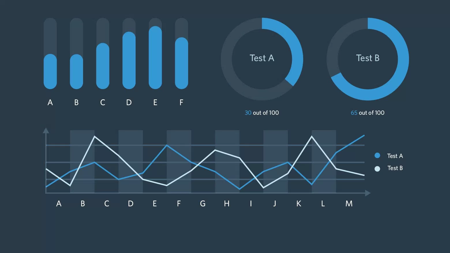
In the big data age, the ability to interpret and analyse huge data sets is of paramount importance. Infographics serve as an invaluable data visualisation tool, turning raw data into meaningful insights. Whether it’s a bar chart showing sales numbers or a heat map highlighting geographic trends, infographics allow users to get insights at a glance, making it easier to make data-driven decisions. In addition, interactive infographics take data visualisation to the next level, allowing users to dynamically explore data and discover hidden patterns and correlations.

Communication of Complex Processes
From software workflows to assembly instructions, many processes are inherently complex and prone to misinterpretation. Infographics excel at communicating complex processes in a clear and concise manner, guiding users through each step with visual cues and annotations. By breaking down processes into sequential steps and visualising dependencies, infographics make seemingly complex tasks more accessible and manageable. Whether it’s an educational infographic or an interactive simulation, infographics empower users to navigate complex processes with confidence and ease.
Accessibility and Inclusiveness
Inclusive design is a core principle of modern user interface design that aims to make digital experiences accessible to users of all abilities. Infographics play a critical role in promoting accessibility by presenting information in a format that is easy to understand, regardless of language or cognitive ability. By including text alternatives and descriptive labels, infographics adapt to users who rely on screen readers or assistive technology. In addition, infographics can be adapted to suit different learning styles and preferences, making the user interface even more inclusive.
Conclusion
In the ever-evolving world of user interface design, infographics stand out as a versatile tool for conveying complex information. From simplifying data visualisation to guiding users through complex processes, infographics play a key role in improving user experience and accessibility. As designers continue to push the boundaries of visual communication, infographics will remain an important asset in their arsenal, helping to bridge the gap between complexity and understanding in the digital realm.