
Project description
The redesign project aimed to enhance the online presence and user experience of a marketing agency specialising in promoting products through email newsletters. The primary goal was to create a gamified design that maintained the professionalism and responsibility associated with the company's services. The redesign involved updating the existing red and black colour palette with refreshed details. Additionally, a range of colours and custom monster icons were developed to complement different sections of the website.Project summary
|
Team: Designer Konstantin Pimenov |
Industry: Marketing |
|
Business goal: to create design that maintained the professionalism and responsibility associated with the company's services |
Expertise: Web design, Graphic design |
|
Applied technologies: Figma |
Business Challenge
The marketing agency faced the challenge of effectively showcasing its services and expertise online while ensuring a captivating and engaging user experience. The existing website design lacked visual appeal and did not effectively communicate the agency’s professionalism and reliability. Furthermore, with increasing competition in the digital marketing space, it was crucial for the agency to differentiate itself and attract potential clients through its online presence.
Solution
To address the business challenge, a comprehensive UI/UX redesign strategy was implemented. The project began with a thorough analysis of the agency’s target audience, competitors, and industry trends. User personas were developed to understand the needs, preferences, and pain points of the target audience.
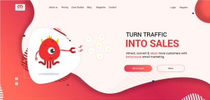
Based on the research insights, a gamified design approach was adopted to inject creativity and engagement into the website while maintaining the seriousness and responsibility associated with the agency’s services. The original red and black colour palette was revamped with updated details to create a visually appealing and cohesive aesthetic.
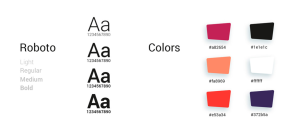
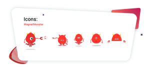
The choice of the Roboto font ensured readability and consistency across different screen sizes and devices. Custom monster icons were designed to complement each block of the website, adding a playful element to the overall design while reinforcing key messaging and visuals.
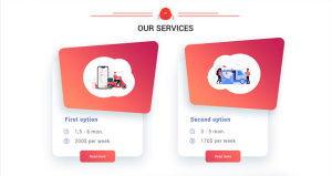
The website’s user interface was redesigned to prioritise ease of navigation, clear communication of services, and intuitive user interactions. Special attention was paid to optimising the website for mobile responsiveness and accessibility.
Delivered Results
The redesign project successfully addressed the business challenge by delivering a visually appealing, engaging, and user-friendly website that effectively showcased the agency’s services and expertise. Key outcomes of the project included:
- Enhanced visual appeal: The refreshed colour palette, custom monster icons, and gamified design approach significantly improved the website’s visual appeal, capturing the attention of visitors and encouraging engagement.
- Improved user experience: The redesigned user interface prioritised ease of navigation, clear communication of services, and intuitive user interactions, resulting in an improved overall user experience.
- Increased online presence: The revamped website effectively communicated the agency’s professionalism and reliability, helping to differentiate it from competitors and attract potential clients.